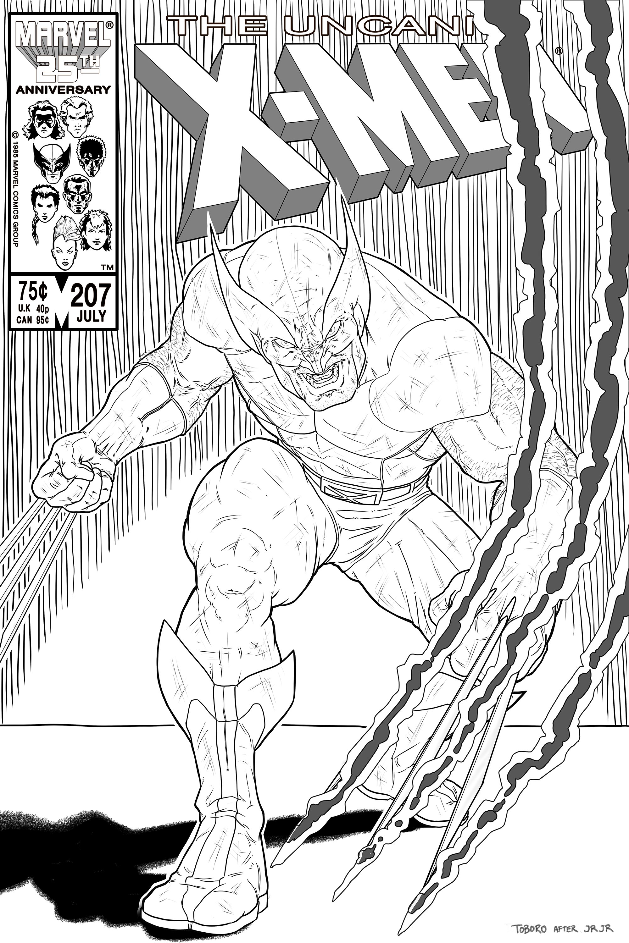
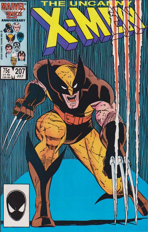
I don’t know why, but john romita jr. didn’t seem to get the recognition he deserved in the 80’s. Maybe people weren’t ready for his style yet. At least, not until later in his career when he started getting accolades for his run on spider-man. Maybe it had to do with his artistic juggernaut of a father overshadowing him. I just never heard people buzzing about him in the shops, but I always dug his art though. There was something refreshing about the consistency of his characters, and how you could immediately tell his work from everyone else. He was really reliable, and his storytelling was usually spot on as well.
When I first started looking at old covers to do homage’s of, this was one of the first. It was so stark, the color contrast, the pose, the way his claws ripped through the page. I’ve always had a hard time being satisfied with the way I draw wolverine. There’s been so many stellar depictions of him over the years that it’s hard to measure up in comparison. Still, this one turned out pretty solid. When looking at the original, I tried to identify areas that could be “improved”. Not many jumped out at me, but I thought that it could use a bit more dynamic motion to the way his arm was cutting, and a more defined sense of spatial depth. Outside of that, it was really just about trying to draw him to the best of my abilities.
Out of the four of these I’ve completed, I really got a sense of direction during the process on this one. The first one was a group composition, which has a unique set of challenges on it’s own. This one came after the homage to x-men 210 and really gave me a breather by only drawing one character. I think the two after are more successful for it. I’m satisfied with it though, mainly due to how the finished piece came out. The more muted color palette really tied it all together, and the golden tint to the logo against the background sure helped it pop off the page.


