I’ve been extremely lucky over the years. My hard work, and (whatever)talent I have, has lead me down a lot of different roads. It’s allowed me to pivot into different fields, and to take on a huge variety of work while spending the last 20 years working in visual fx. From motion comics and web animation, to murals, storyboards, illustrations, graphic design, apparel design, beer labels, and tattooing(to name a few) . My first artistic love though, that was comic books.
While I never forgot that love, and have had the privilege over the years to work on a couple big comic book adaptations like sin city, hellboy, league of extraodinary hentlemen, blade 3, and the tick. There’s still something so refreshing about drawing comic book art. Maybe it reminds me of being a kid and spending countless hours leaving indents on the dining room table, or the years hunched over a drafting table as a teen… but the idea that you can sit down with a blank page and create something from start to finish that can sit in a frame… there’s a power in that.
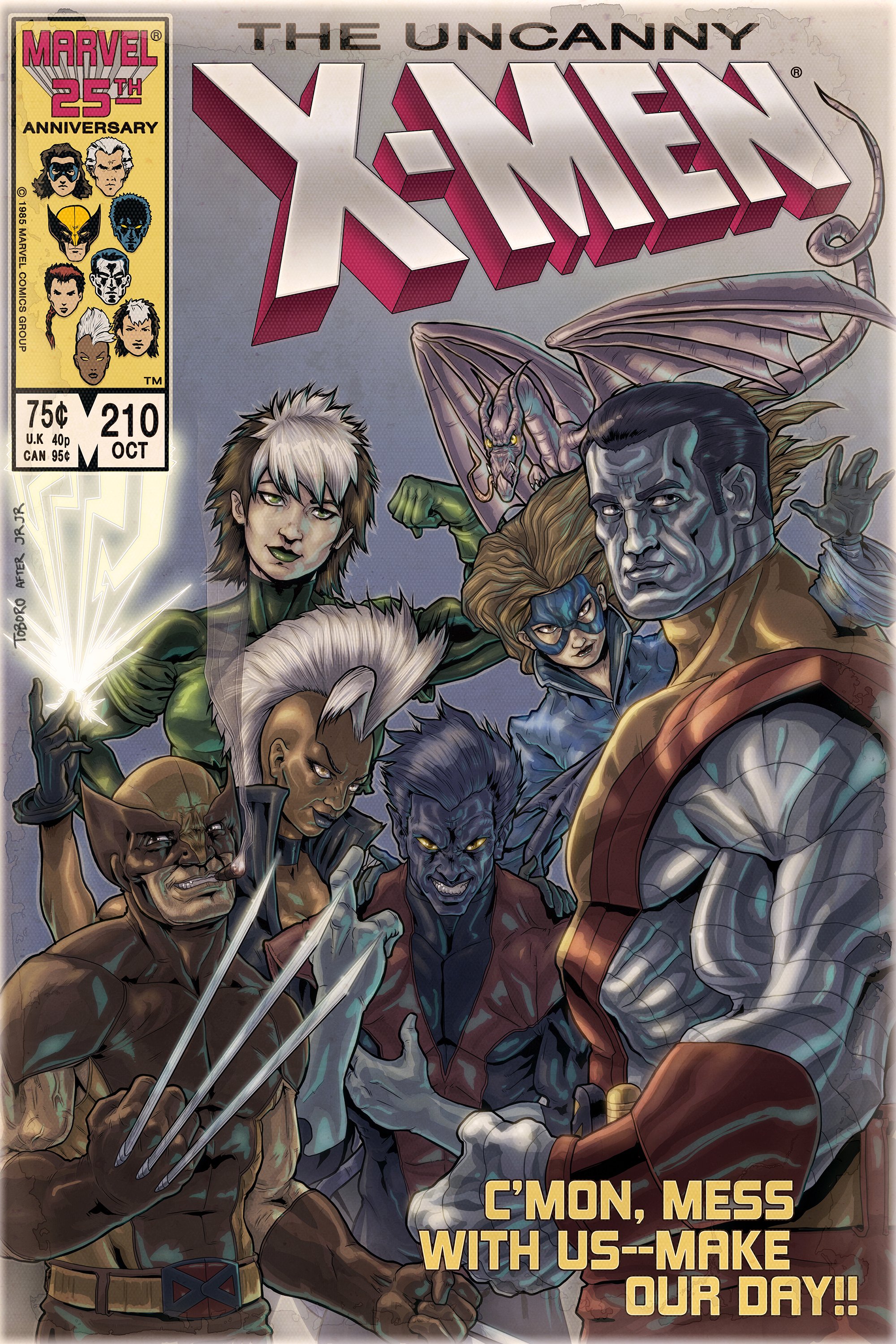
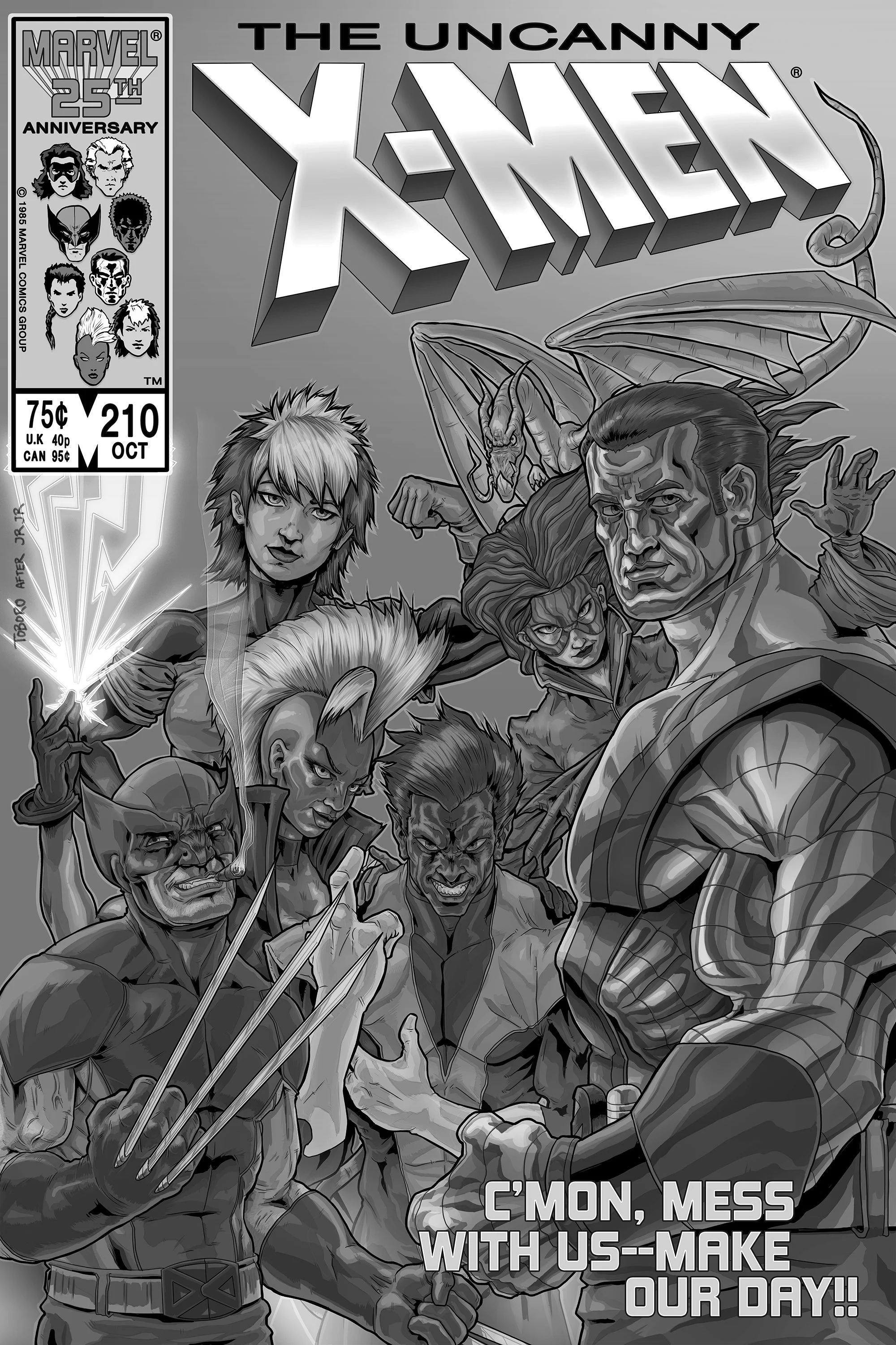
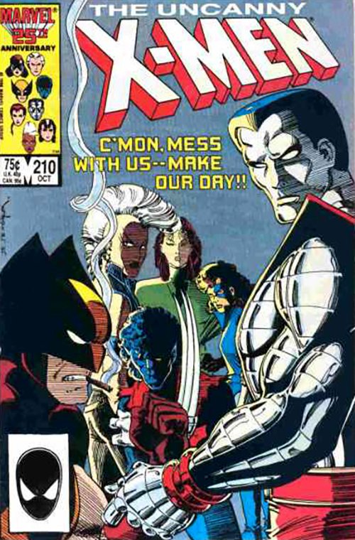
This was another favorite cover of mine, but there were things that always bothered me about it. It felt a bit rushed to me, and something about the overlapping perspective felt off. Not that there aren’t a ton of flaws in my finished piece (I’ll let you decide where they are), but the thing that bothers me the most is that I don’t think the style on this one was as solid as it is on the other three. I think everything started to gel better together on those. Although, I am pretty happy with how Nightcrawler came out.


